Branding a breakthrough in sustainable food production

When Meiogenix, a pioneering biotech company advancing chromosome editing in plants, secured their Series A funding, they stood at a crossroads: ready to scale commercially, but with a brand and website still rooted in their research phase.
Meiogenix partnered with Kvalifik to define a new brand identity and digital presence that would match their ambition to lead the next generation of agricultural innovation.
The old website primarily spoke to the scientific community. With new investors and an expanding partner network, Meiogenix needed to communicate their impact in a more commercial and accessible way – while keeping their scientific credibility intact.
They also needed a coherent visual identity that could unify everything from investor decks to lab materials, and a digital platform capable of growing with their business.
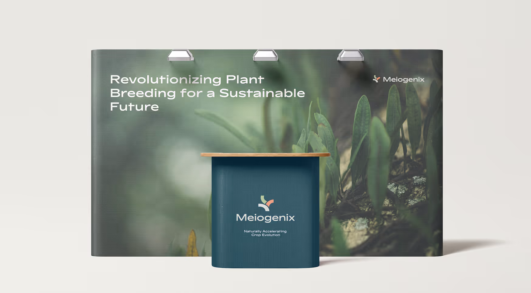
The result is a confident, international-facing brand and website that bring Meiogenix’s mission to life – credible enough for scientists, compelling enough for investors, and inspiring enough for collaborators around the world.
A new identity and digital pressence that position Meiogenix as a leader in agricultural biotechnology.
Logo design
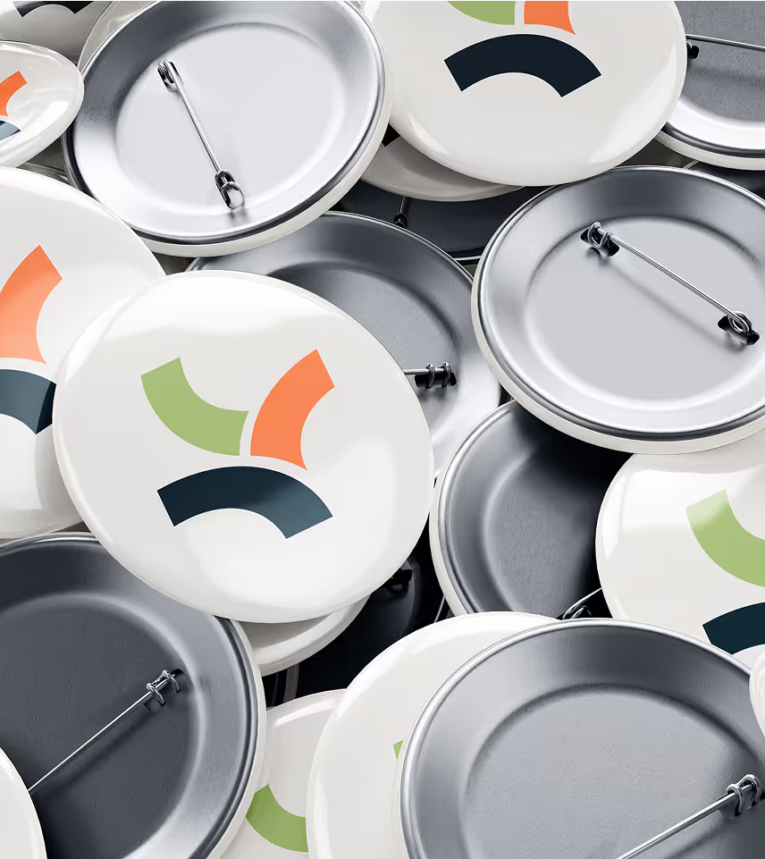
A new mark

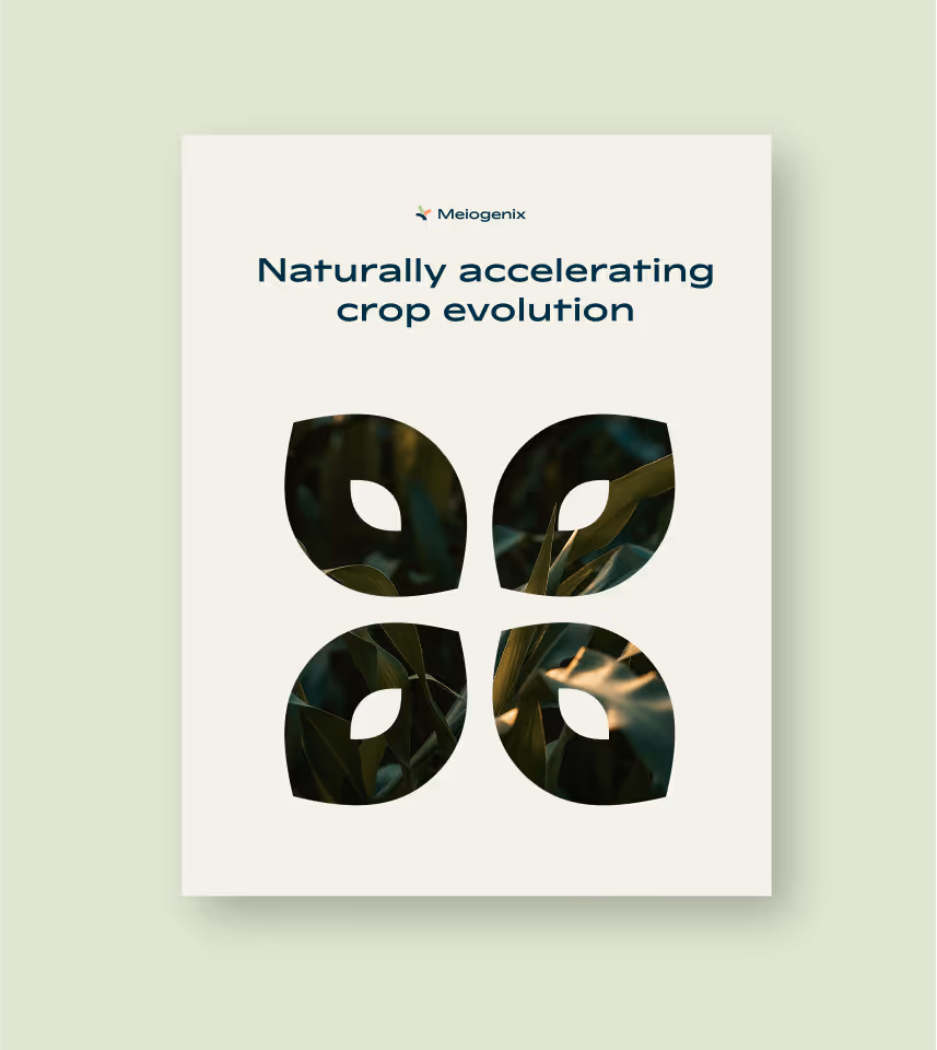
Brand identity
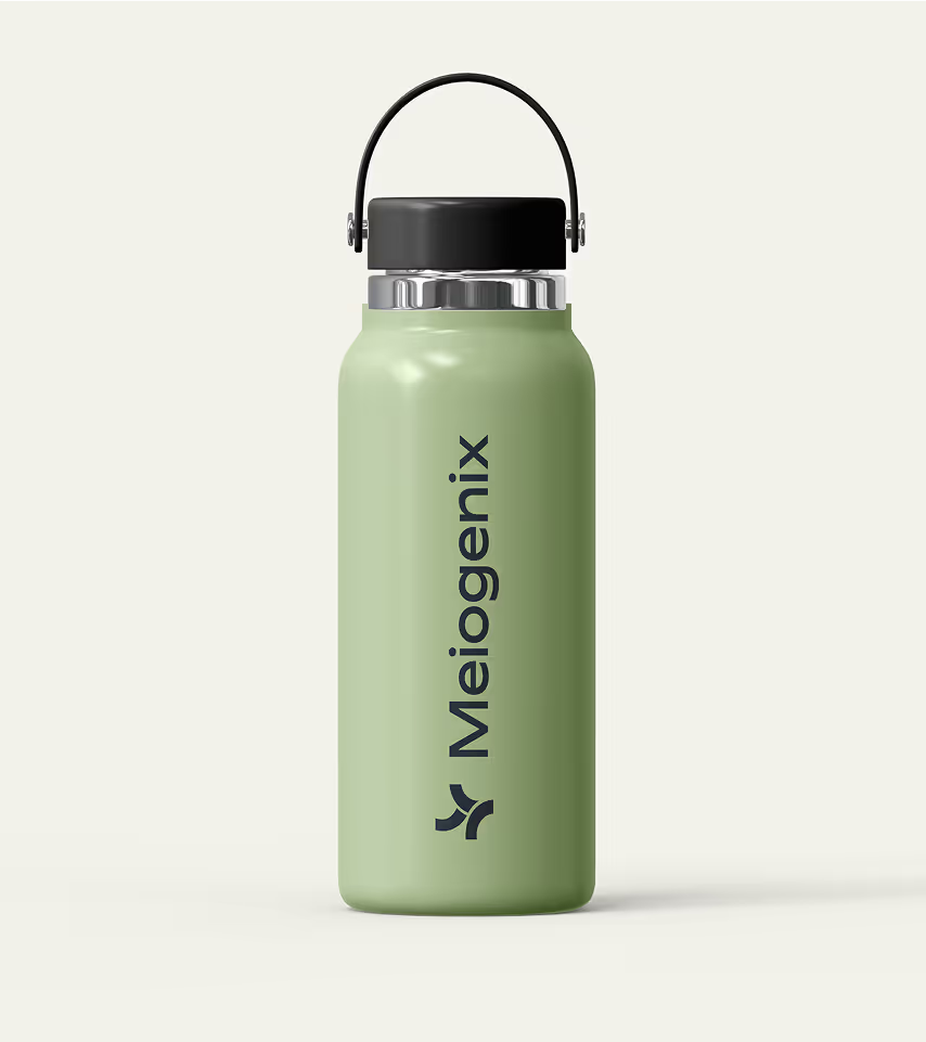
A complete visual identity
Webdesign
A modern website
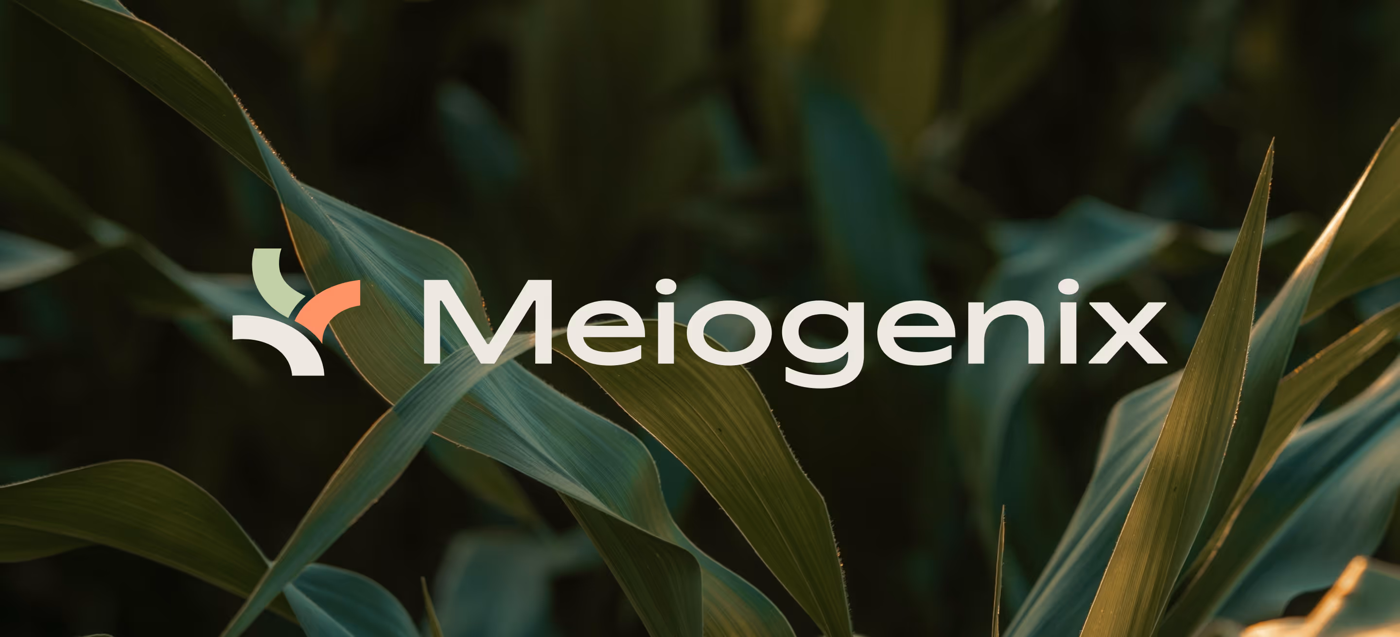
The Meiogenix logo embodies the company’s mission of advancing plant genetics through precision, science, and innovation. Its form is deliberately layered with meaning:


Logo construction


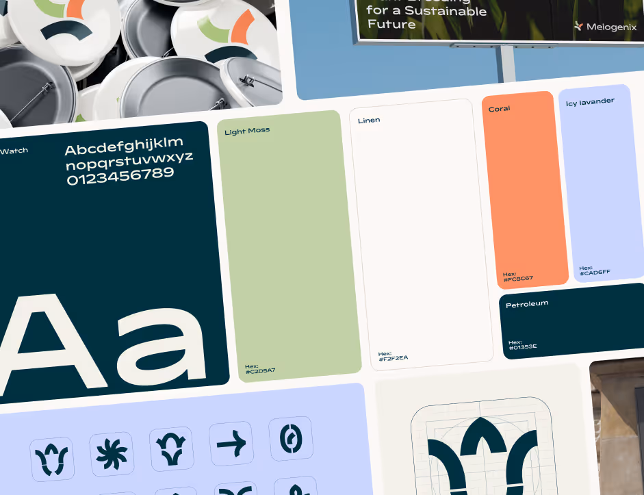
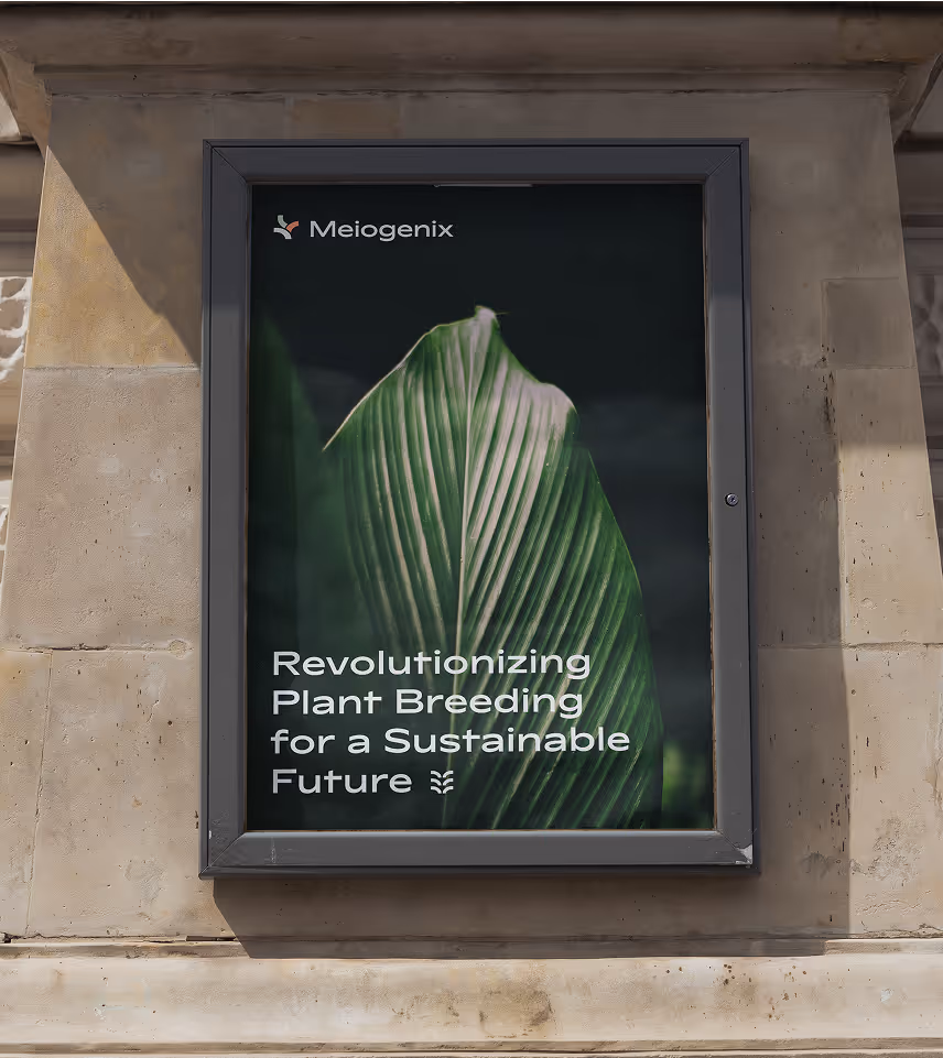
The Meiogenix identity combines scientific precision with natural harmony.
A fresh color palette evokes both lab-grade clarity and organic growth. The bold, scientific typeface gives structure and confidence, while natural imagery grounds the brand in the world it helps cultivate.


A central element in our branding are pictograms that are abstract representations of plants and other concepts related to our technology (chromosones, DNA). The pictograms are created from cut out sections from our primary font, in the same way as the logomark. This gives a coherent look.


We began with a brand strategy workshop to define Meiogenix’s vision, values, and visual direction. From there, we developed mood boards, logo concepts, and a full visual identity, documented in a clear brand guide.
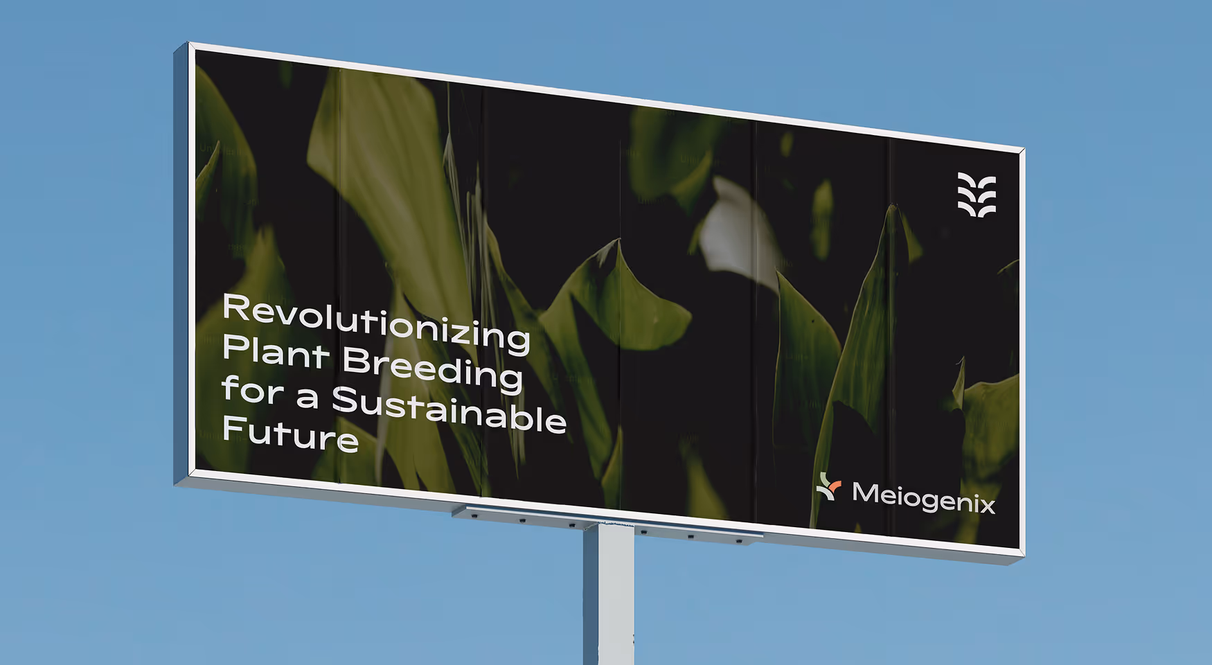
The identity was extended across templates and presentations, including a PowerPoint deck and social assets, and supported by an animation explaining Meiogenix’s chromosome recombination technology.
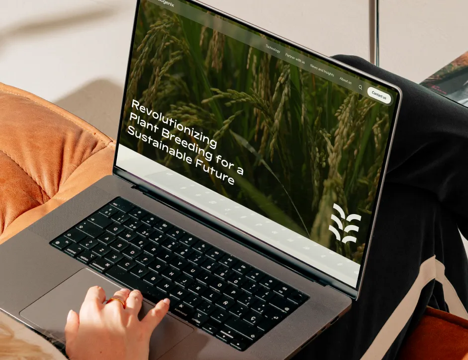
Building on this foundation, Kvalifik designed and developed a modern, multilingual website in Webflow, from sitemap and wireframes to final launch, and trained the team to manage and expand it independently.
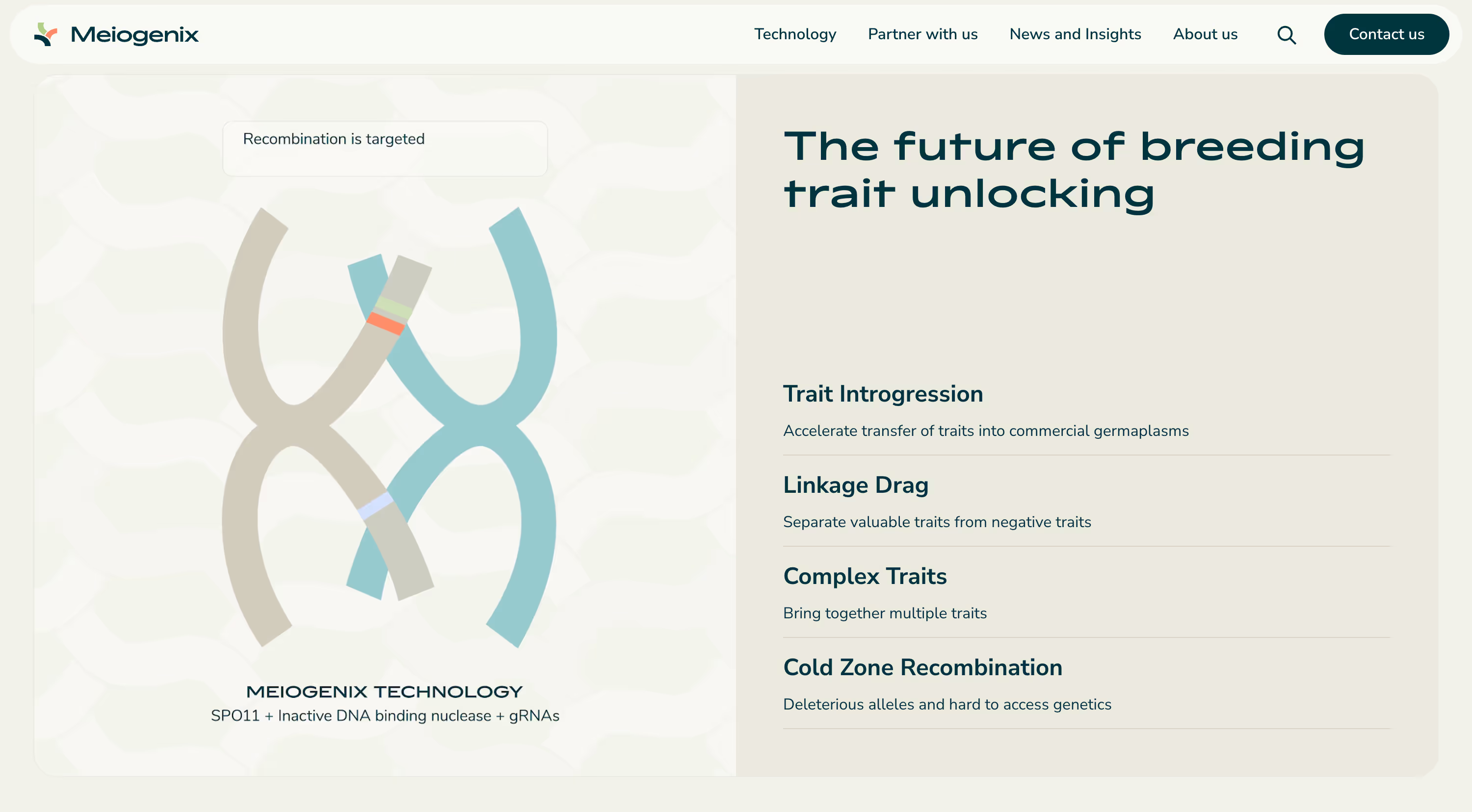
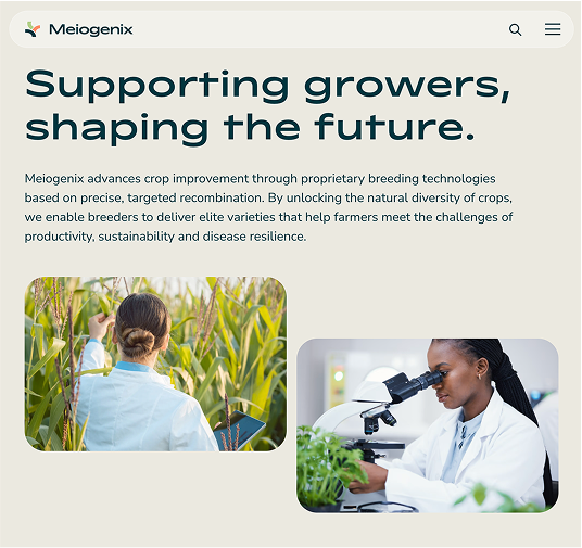
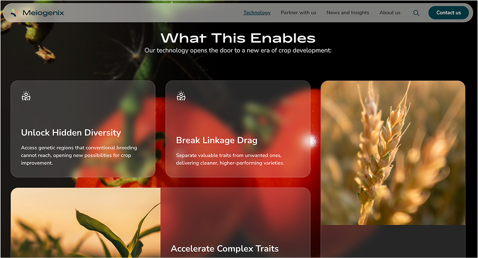
The Meiogenix website presents advanced biotechnology in a clear and approachable way.
Built in Webflow, it’s structured to guide visitors from the company’s vision to its technologies, partnerships, and latest insights. The layout is simple and logical, with warm photography and quiet animations that connect science to nature.