A precise brand identity for maritime intelligence

Black Shade works in a complex maritime context, where information is often fragmented, layered and difficult to act on.
Kvalifik created a logo and brand identity that turns that complexity into a clear visual system. The identity is built around structure, precision and calm confidence. It helps Black Shade communicate trust, control and clarity in a field where decisions depend on understanding what is happening fast.
The result is a modular brand system with a sharp logo, a clear visual language and a digital first identity designed for modern platforms and operational environments.
Logo Design
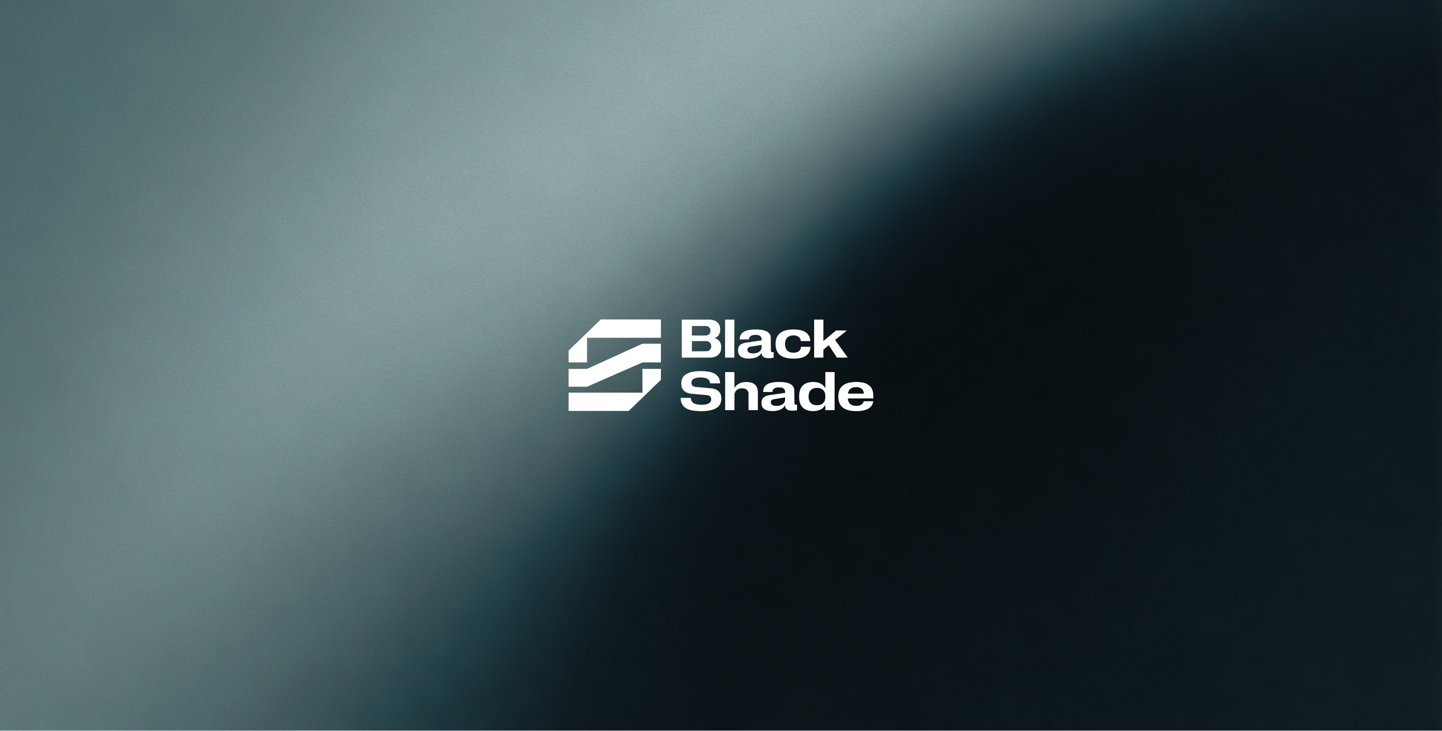
A sharp and structured symbol that shows how complexity can be filtered into clarity. The layered mark creates a strong, recognizable identity with a sense of precision and movement.

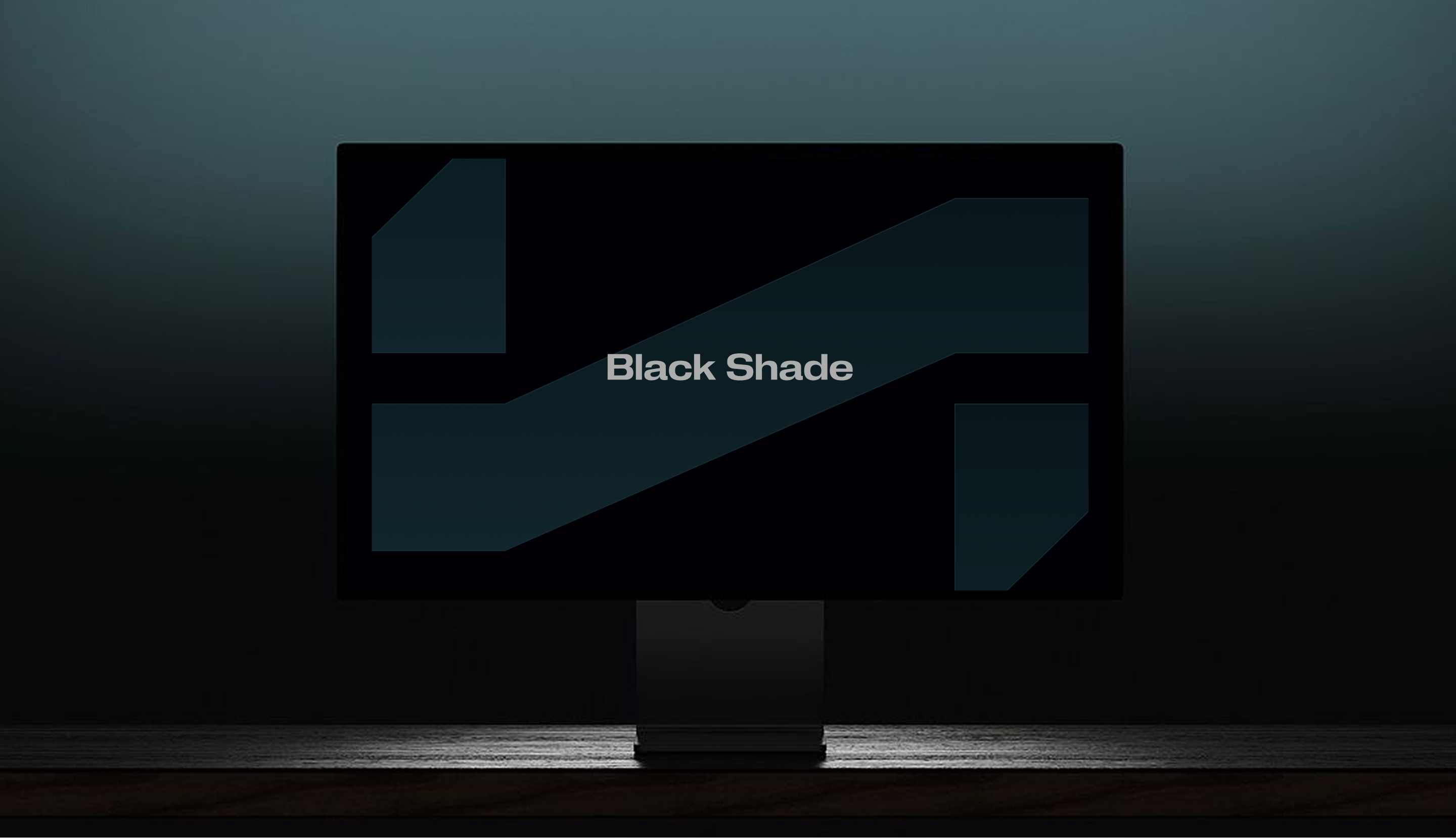
Visual Identity
A modular visual system built around clarity, confidence and control. The identity uses structure, layering and a focused color palette to create a calm but powerful brand presence.
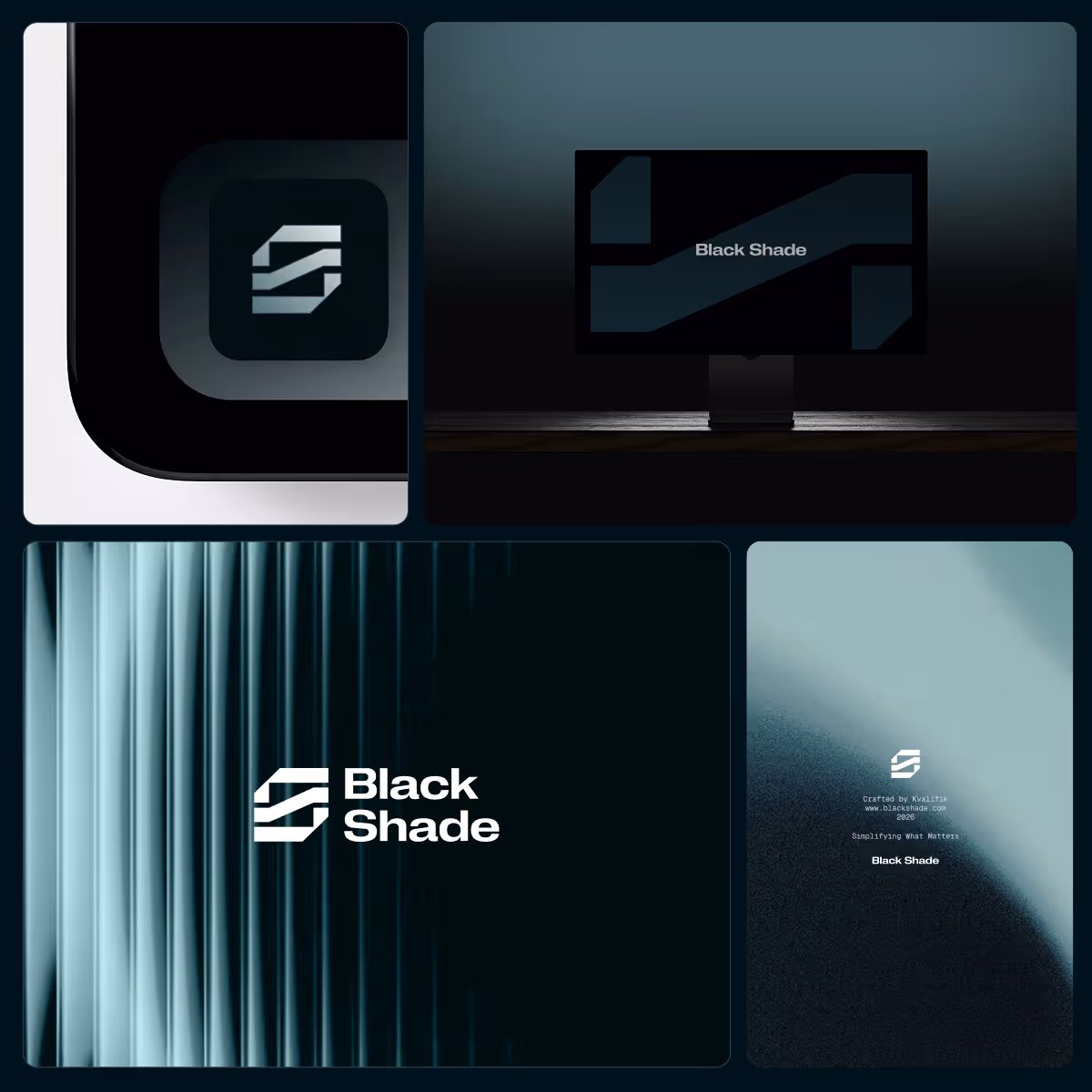
The Black Shade logo represents the process of filtering complexity into precision. Its layered structure reflects how information is organized, refined, and transformed into clarity. The upward movement within the mark symbolizes emerging from uncertainty, directly connecting to the idea of “coming out of the shade.”
Sharp geometric forms communicate strength, stability, and technical precision, while subtle hidden letterforms create a unique and recognizable identity. The typography balances this structure with softer geometric curves, adding a more human and approachable feel.


The logo is built on a precise modular grid system that reinforces structure, scalability, and consistency. Each layer within the symbol represents a stage of filtering and refinement, reflecting the logic behind BlackShade’s technology.
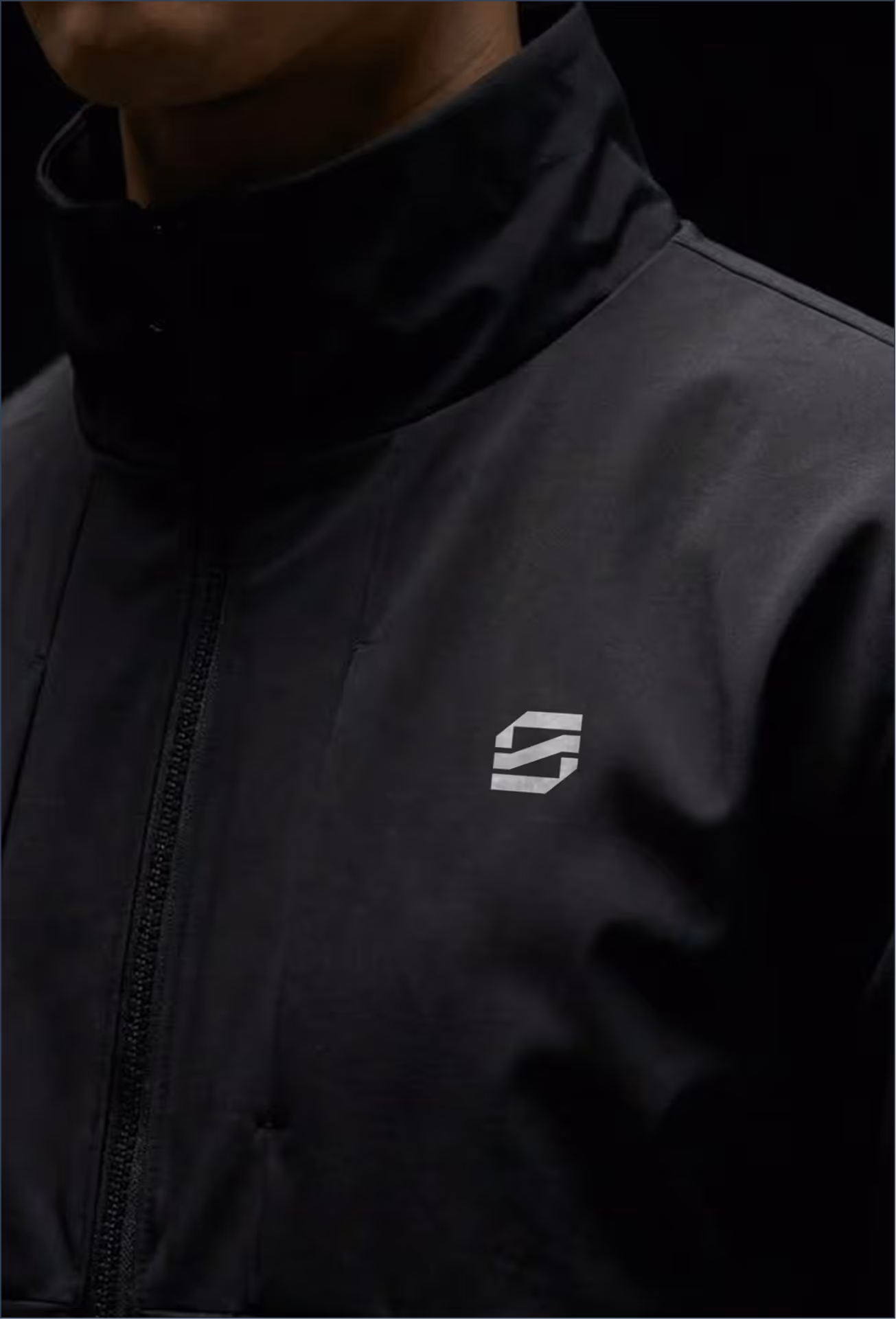
This modular approach also extends into the wider identity system, where elements from the logo can be reused across layouts, patterns, icons, and digital applications, creating a flexible and cohesive visual language.
The branding system expands the logo into a clean and structured visual language based on layering, reduction, and clarity. Graphic elements and icons are derived directly from the symbol, reinforcing consistency across all applications.
The color palette centers around teal and its darker shades fading into black, expressing intelligence, depth, and confidence. Combined with minimal layouts and precise typography, the identity creates a calm yet powerful presence that reflects BlackShade’s ability to transform complexity into clear insight.


FAQs
Below are some of the most common questions about visual identity and branding projects by Kvalifik.
Black Shade operated in a complex and highly technical space. The goal was to create a clearer and more recognizable identity that could communicate confidence, precision and trust across every touchpoint.
The logo was designed around the idea of filtering complexity into clarity. The layered structure reflects how fragmented information can be organized, refined and transformed into actionable insight.
Kvalifik focused on building a visual identity that balanced technical precision with a calm and human expression. The work included logo design, typography, color direction, modular systems and digital brand applications.
A modular system made it possible to scale the brand consistently across digital platforms, presentations, interfaces, icons and future applications while keeping the identity recognizable and structured.
The typography balances sharp geometric structure with softer curves. This creates a more approachable and modern feel while still supporting the technical and operational nature of the brand.
The palette was built around deep teal tones fading into darker shades and black. The colors were chosen to communicate intelligence, depth, precision and calm control.
The identity combines layering, reduction and geometric precision into a clear visual language. Hidden details in the logo and repeated structural principles across the system help create a recognizable and ownable brand presence.
The client name and parts of the project have been anonymized due to confidentiality. The case focuses on the branding and visual identity work created by Kvalifik rather than the company itself.