
The digital experience has probably never been more important, and visitors now expect more of an experience when they go online. The website has to be fast, look good and be responsive for all devices. But what do you need to consider, and how can you improve the user experience for your visitors?
Remember good contrast between colours
Text on top of a photo or text on a coloured background can, in some cases, make it difficult for visitors to read the content you have written. Worst case, your visitors will leave the page without reading the content.
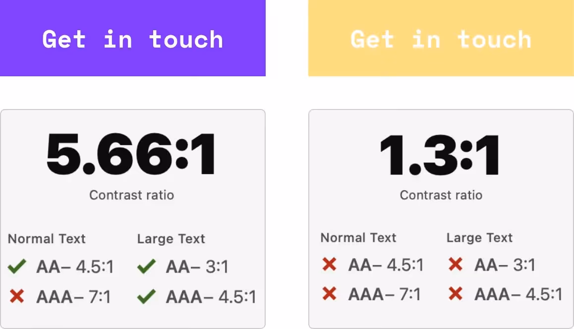
A good idea can be to use an online contrast checker (like this one). A contrast checker can help you make sure that the colours you are using are user-friendly and hence your text is legible for the visitors.
When evaluating colour contrast it also makes sense to consider if the main font you use for written content is the right one - is it easy to read?
Is your call-to-action clear?
Another struggle for visitors can occur on a website when it isn't clear what they should do on the site. If that isn't clear, it can cause irritation and worst case the visitor will go to a competitor to get the information or buy the products.
For you, this means it will be more difficult to convert visitors into new customers.
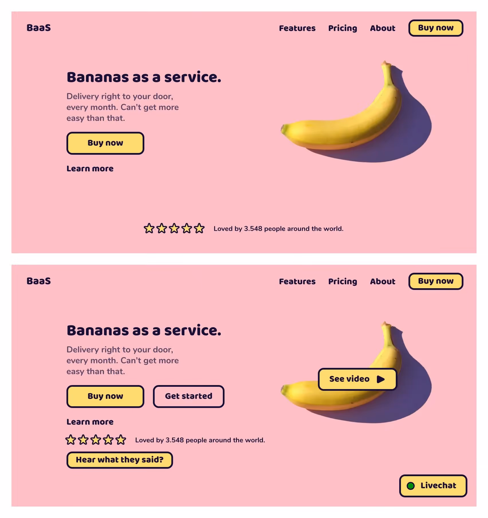
One way to test this is to review the page. Think about what you would like the visitor to achieve during the visit, so that you can make it more clear and obvious to the user - possibly with someone who has not seen the site or is perhaps not online that often.
Are you drowning your visitors in text?
We probably all know it, coming to a website and being blasted by a wall of text. It seems overwhelming and perhaps to an extent that we simply cannot bear to read it and thus miss something interesting.
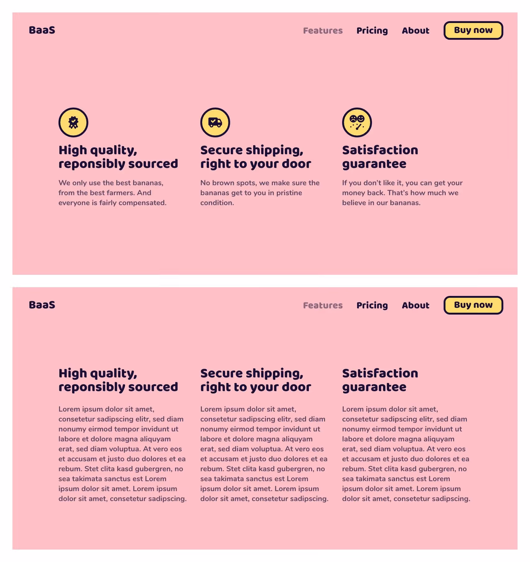
Instead, consider cutting the text and create a sensible hierarchy. This is also a fine time to consider which points are the most important and make sure they stand out the most on the page.