


- Anja Bjerno (Former Employee)
- Ida Elisabeth Jensen
- Ana Carolina Rijo
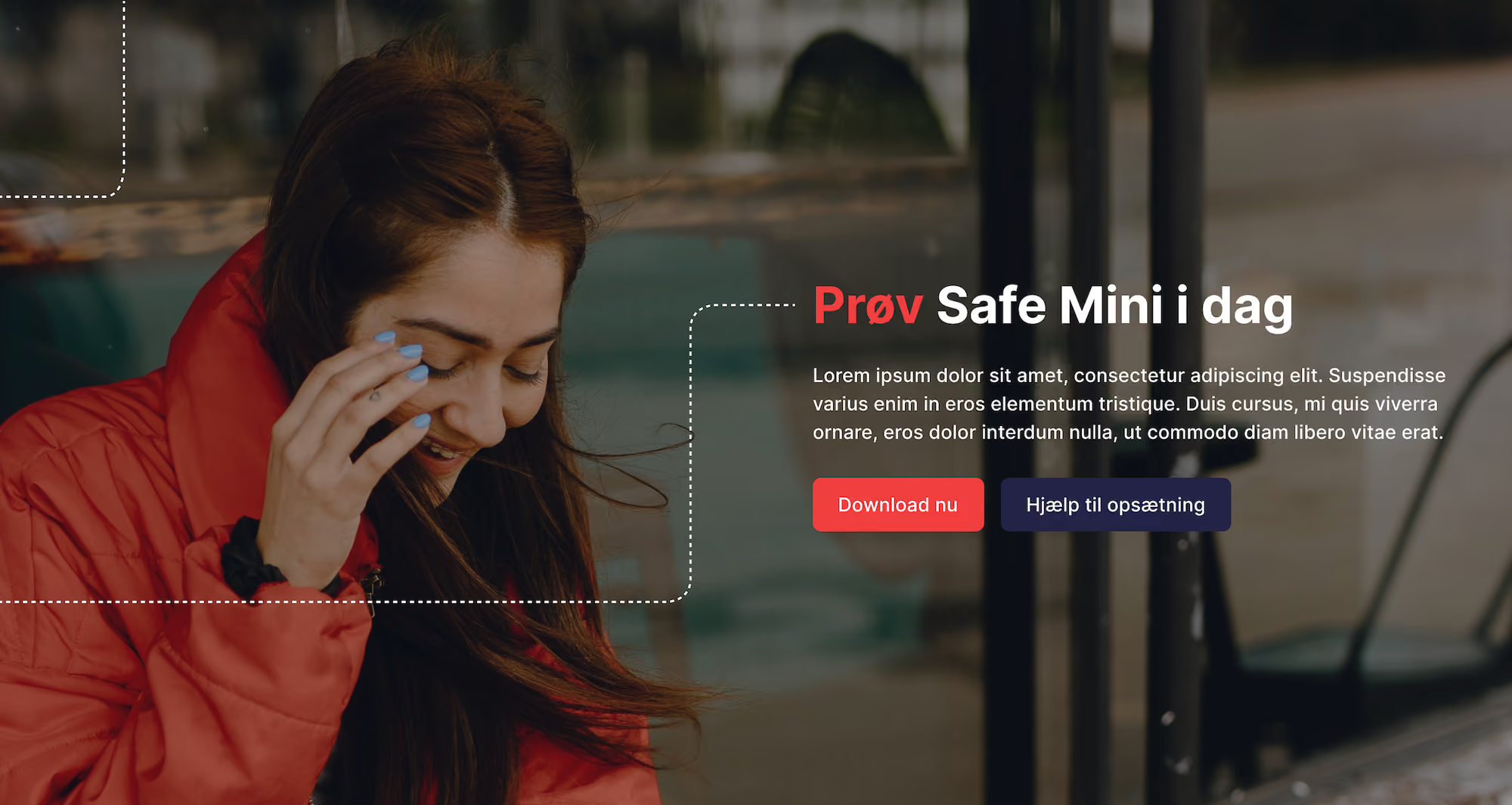
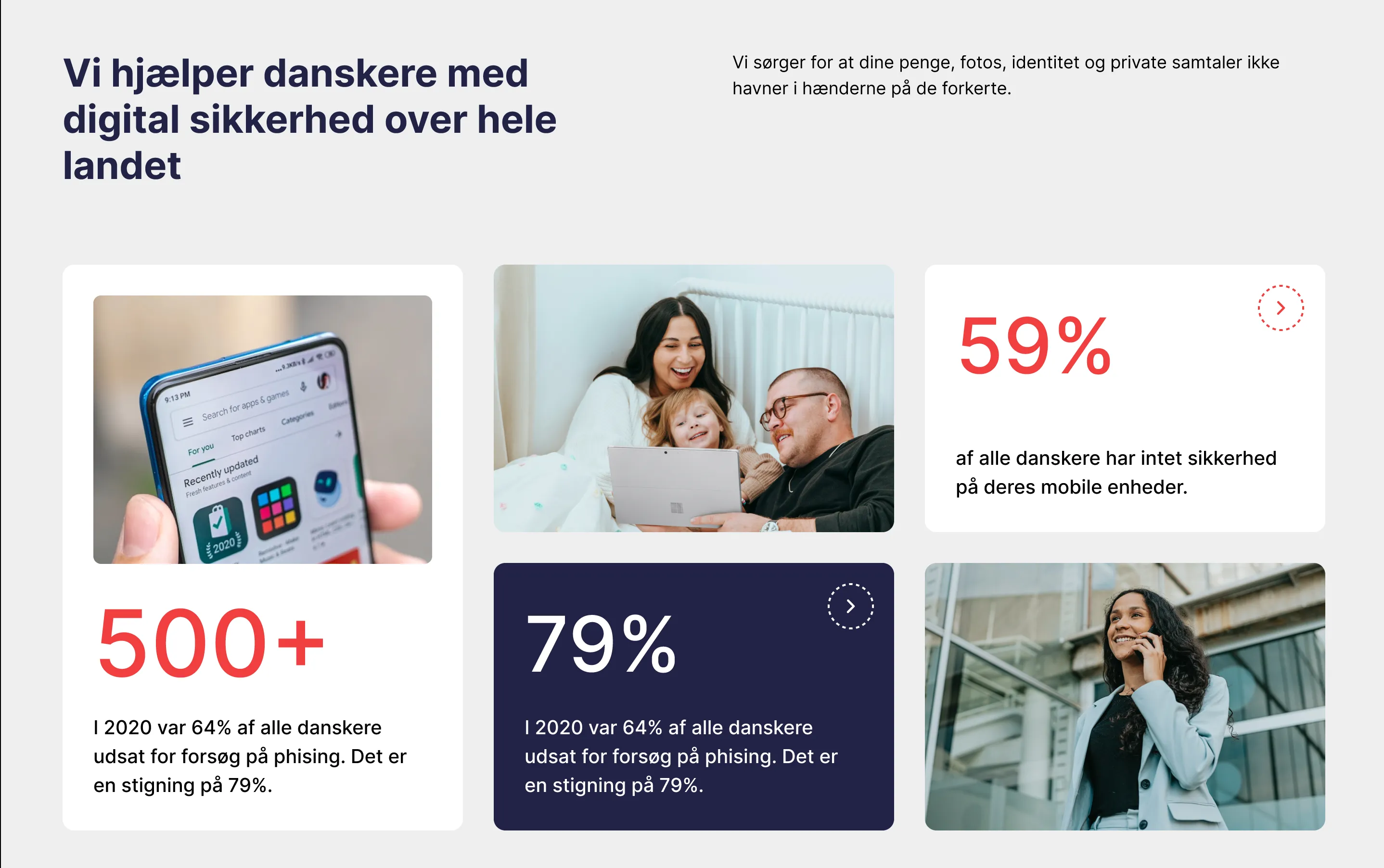
Because the old one described a company We Are Safe no longer was. We Are Safe had grown into a modern IT security provider with its own software, but the website positioned it closer to traditional IT support. The people behind the company were invisible, the product was barely shown, and a dominant red made the whole site feel harsh.
To stop depending on developers for every change. On Drupal, We Are Safe needed developer resources to update the website, time that should have gone into improving the product. In Webflow, the team does it themselves. As CTO Oscar Iversen puts it, "Now we can do a new landing page in 5 minutes instead of it taking weeks in Drupal."
With careful content mapping and redirects. A large share of We Are Safe's traffic came from organic search, so protecting SEO was a hard requirement for the move to Webflow. We mapped the content and handled the redirects with care, which kept search visibility intact. We Are Safe's SEO performance was preserved through the migration.
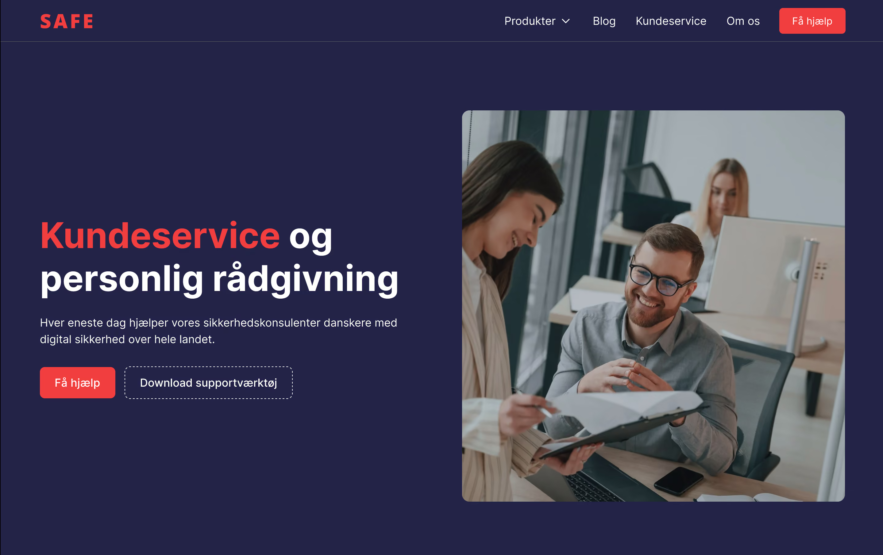
From IT support to IT security. We started by redefining the site's structure and messaging around that shift, then used UX wireframes to set the content hierarchy and user flows. A focused visual design phase gave the brand a new, calmer expression, built and refined directly in Webflow. Today We Are Safe presents itself as a modern IT security SaaS provider.

We Are Safe had outgrown their existing website. While the company had evolved into a modern IT security provider with proprietary software, the digital presence still reflected a very different reality.
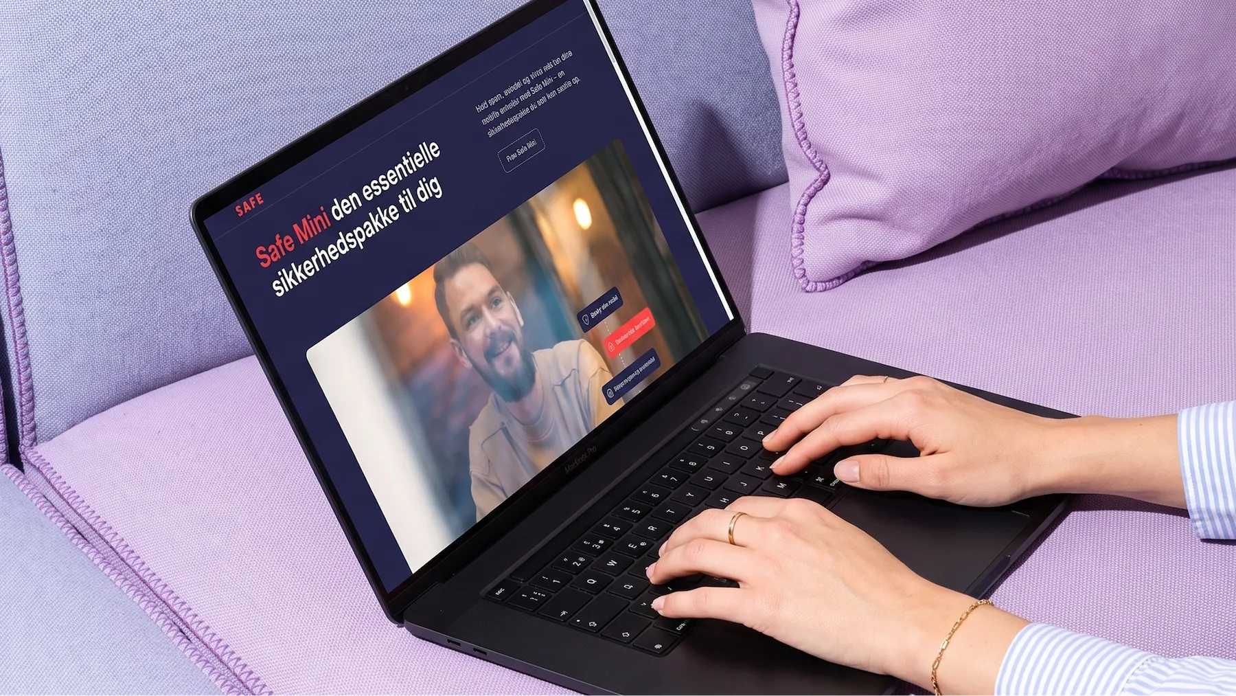
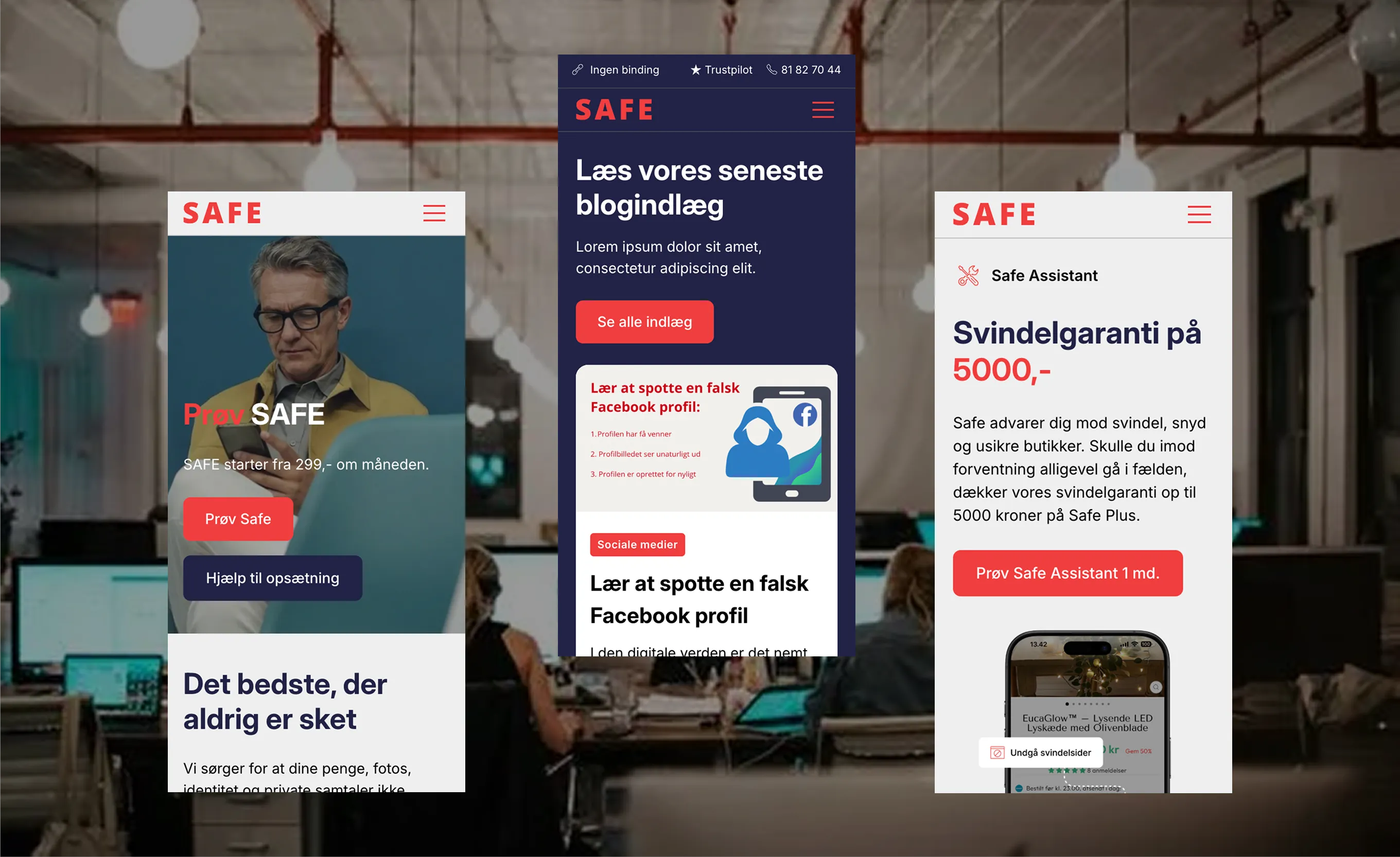
The new website clearly communicates who We Are Safe are, what they offer, and how their software creates value. The company is now positioned as a modern IT security SaaS provider rather than a generic support function. SEO performance was preserved during the migration, and the internal team now has a scalable platform that supports growth, credibility, and future product development.
The client felt limited by their old Drupal solution, and it was frustrating having to rely on developer resources to make changes to the website instead of improving their product.
On the old website, it was difficult to understand who We Are Safe actually were. The people behind the company were invisible, and despite having developed their own software, the product itself was barely shown. Visually, the site leaned heavily on a single dominant color: red. While intended to signal danger and security, it instead created a harsh and one-dimensional expression.
At the same time, the site positioned We Are Safe closer to traditional IT support than to a professional IT security company, even giving associations to “IT support for the elderly”. Complicating matters further, a large share of traffic came from organic search, making SEO preservation a critical requirement during any platform migration.
We began by redefining the site’s structure and messaging to support the strategic shift from IT support to IT security. UX wireframes clarified content hierarchy and user flows, followed by a focused visual design phase that established the new, calmer expression. Design and development were closely integrated in Webflow, allowing rapid iteration and high-fidelity execution.
Throughout the migration, content mapping and redirects were handled carefully to protect existing SEO value, ensuring continuity in search visibility while moving to a more flexible platform.
See other cases